UX Best Practices: Three Rules for Effective Calls-to-Action
All call-to-action encourages a behavior—the idea is to get a user to do something. In order for calls-to-action to be effective, your team must first map out what you want users to do (ensuring that aligns with what goals they want to accomplish) and what steps they must take as part of that process. Without this clarity, even the most effective call-to-action won’t help you achieve your business goals.
Assuming you have this clarity, here are three recommendations for crafting calls-to-action that encourage your users to move forward.
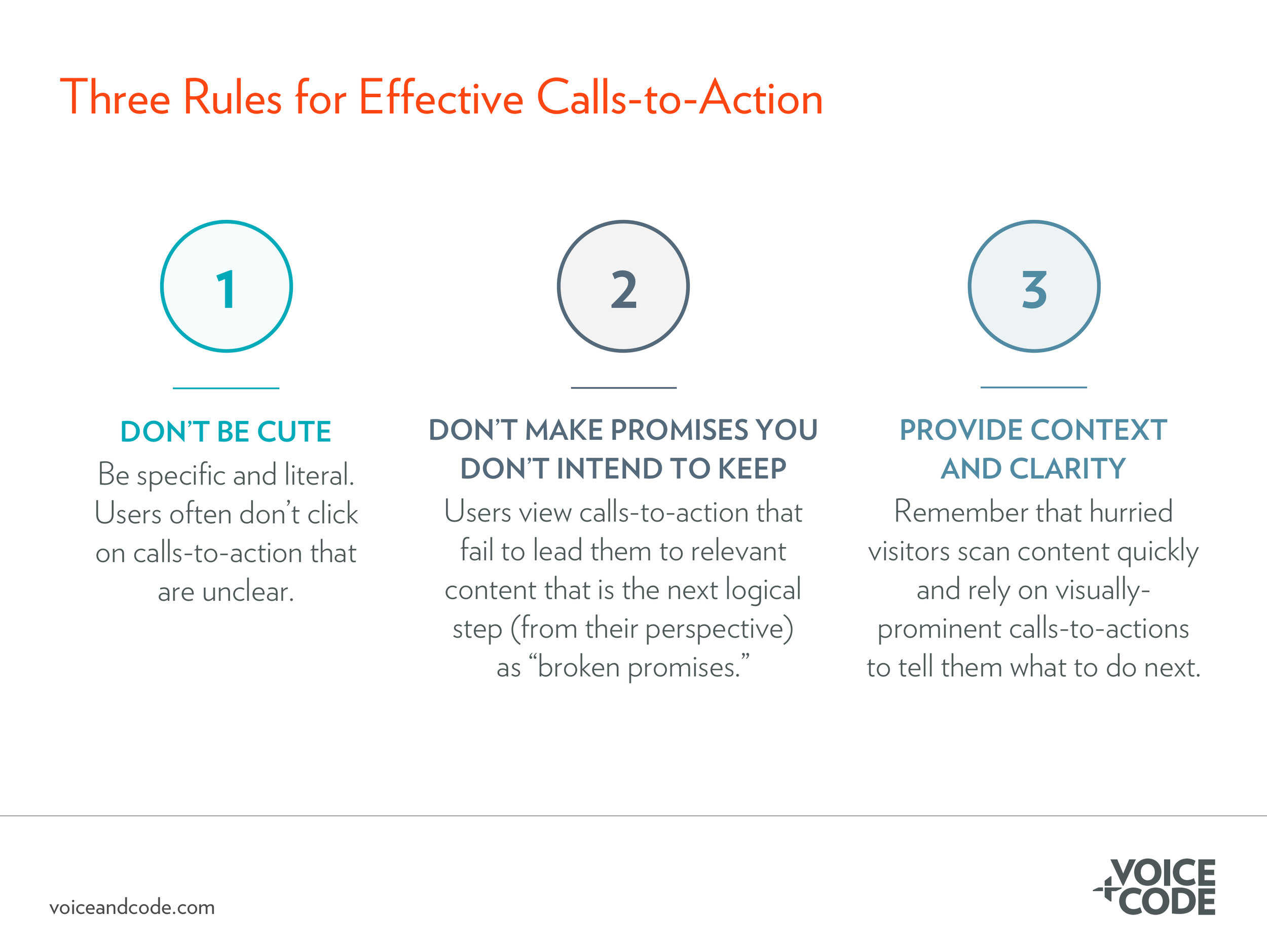
Don’t be cute. Be specific and literal. When users are unsure of where a call-to-action might lead them, they tend to ignore them and move on. A bad example: Make It Happen. A good example:
Don’t make promises you don’t intend to keep. Through your user research you know, from the users’ perspective, what is the next logical step in the process of, for example, learning about your product or understanding how your nonprofit achieves its mission. Calls-to-action should lead to helpful, relevant content that is the next step in the interaction. When a call-to-action leads to irrelevant content or a form a user isn’t ready to fill out yet, users feel like the call-to-action was a “broken promise.”
Provide context and clarity. Calls-to-action tend to be some of the most visually-prominent elements on a page. That’s fine, it just means that hurried visitors, as they quickly scan and skip around content, will rely on calls-to-action to tell them what to do next. Ensure the call-to-action and the content immediately surrounding it provide enough information to move forward—even if the user has missed most of the rest of the content on the page.
Interested in learning more about crafting effective calls-to-action? Read our full blog post about calls-to-action.

