Our Insights
UX Best Practices: Using Card Sorting Exercises
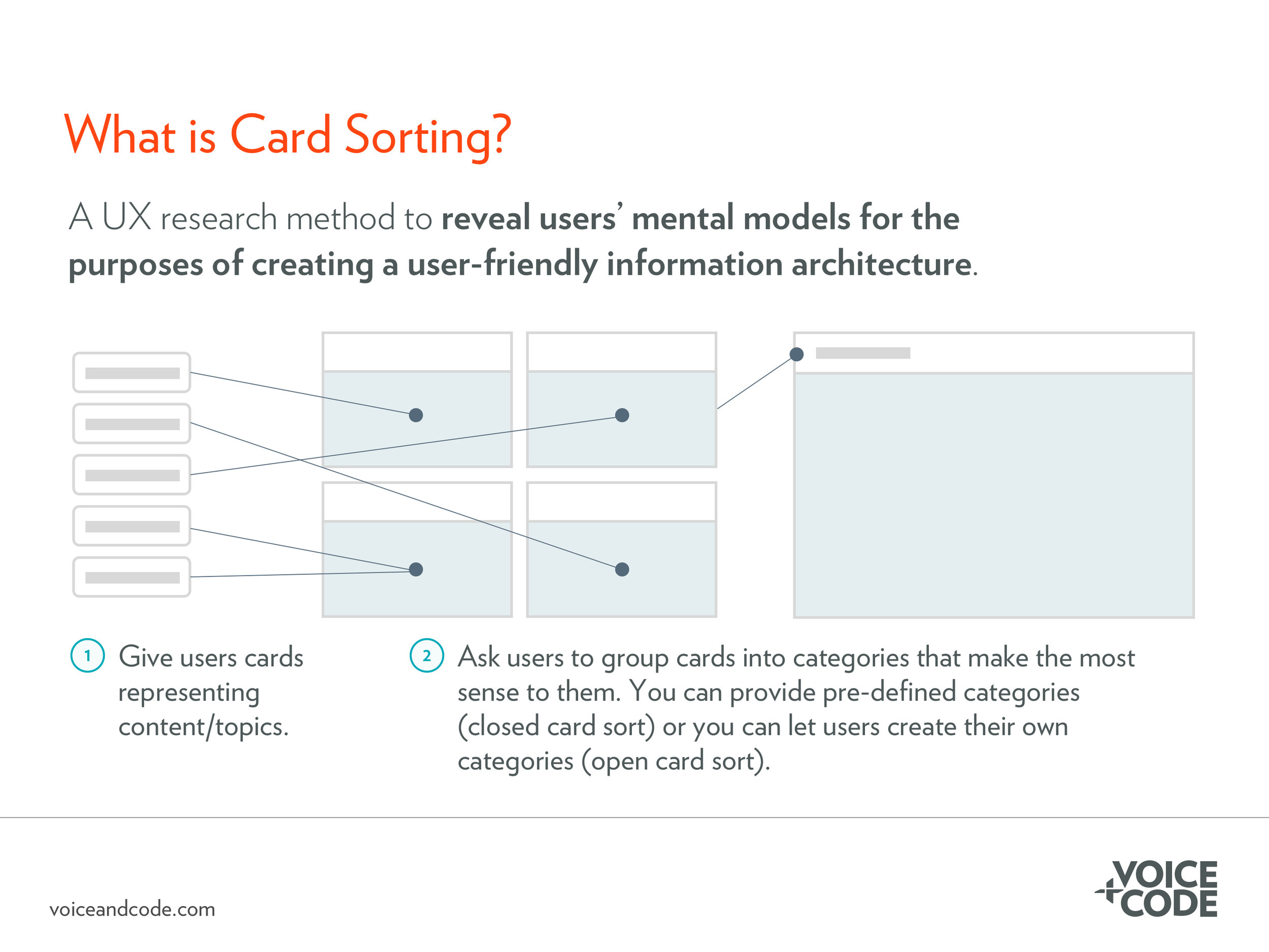
Card sorting is a low cost, effective user experience research method used to understand how users would group information on your website, app, or other digital product.
UX Best Practices: Use Breadcrumbs to Help Users Navigate Your Website
Breadcrumbs allow users to see their current location relative to the rest of the site. They are particularly helpful on websites with large menus and many layers.
UX Best Practices: Minimum Target Size on Mobile Devices
On mobile devices, target sizes should be at least 48 CSS pixels by 48 CSS pixels (approximately 9mm by 9mm) and tappable elements should be spaced at least 10 CSS pixels apart.
UX Best Practices: How to Write Error Messages
Prepare for what will inevitably go wrong and use error messages to help the user complete the task successfully and provide helpful information about how to prevent the issue from happening again.
UX Best Practices: Include Labels with Icons
In most cases, include labels with icons, even when your team considers an icon to be “universal.” Providing a label name on hover isn’t enough.
UX Best Practices: Three Rules for Effective Calls-to-Action
In order for calls-to-action to be effective, your team must first map out what you want users to do (ensuring that aligns with what goals they want to accomplish) and what steps they must take as part of that process. Without this clarity, even the most effective call-to-action won’t help you achieve your business goals.
UX Best Practices: What is a Diary Study?
A diary study is a longitudinal user experience (UX) research method that allows your team to explore how users use your digital product over time. Diary studies often include a combination of videos, photos, and survey questions, in addition to product analytics, which provides your team with a rich mix of qualitative and quantitative data.
UX Best Practices: Tips for Creating and Displaying Content for Hurried Visitors
Website visitors don’t read every single word on a website. Instead, they jump around content and pages, looking for clues that indicate they are getting closer to their goal. Because of this, it’s important to craft copy that will ensure website visitors understand your message and see a clear path forward to accomplishing their goals.
UX Best Practices: Don’t Use Hamburger Menus When You Have Room to Display Primary Navigation Menu Items
A hamburger menu should not be used when there is plenty of real estate to display menu items. On devices with less real estate (like smartphones), using a hamburger menu is sometimes a necessity. When a hamburger menu is used in these circumstances, it should be accompanied by a clear “menu” label above or below the horizontal lines.


