UX Best Practices: Use Breadcrumbs to Help Users Navigate Your Website
Breadcrumbs allow users to see their current location relative to the rest of the site. They are particularly helpful on websites with large menus and many layers. Keep in mind, when users first encounter your website they are trying to establish where they are and where they can go, relative to their specific goal. Breadcrumbs allow users to orient themselves quickly so they can complete tasks faster.
Follow these best practices on when and how to use breadcrumbs:
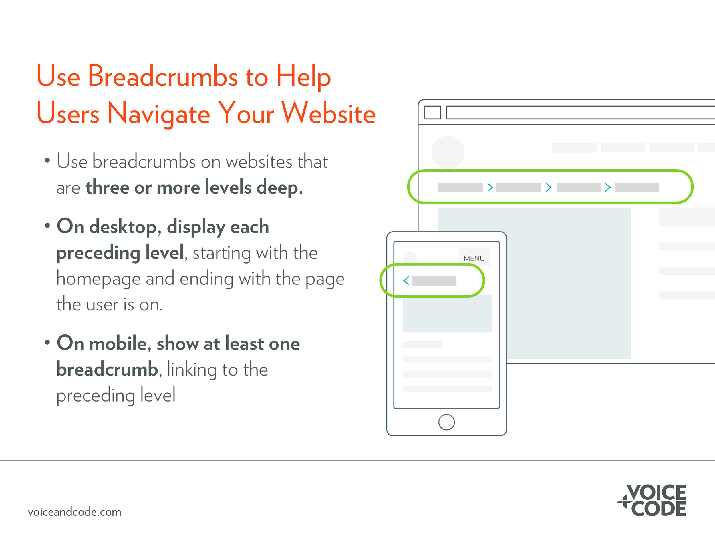
Use breadcrumbs on websites that are three or more layers deep. It’s unnecessary to have breadcrumbs on a simple website where users can’t navigate beyond the primary navigation. However, on complex websites where the users can navigate into a number of subcategories, breadcrumbs are extremely useful in helping the user orient themselves.
Place breadcrumbs under the primary navigation menu on the top left of the page. This is where users expect to find breadcrumbs.
On desktop, link to each preceding layer. A link to the homepage should be the first layer of the breadcrumb.
On mobile, where space is limited, show at least one breadcrumb, linking to the preceding level. It can actually decrease usability on mobile to show a long sequence of levels. So, in this circumstance, simply linking to the previous level is often preferable.
Need everyone on your team to think like a UX designer? Our in-house workshop, UX Best Practices, reviews accessibility, usability, visual design, and mobile design best practices.

