UX Best Practices: Minimum Target Size on Mobile Devices
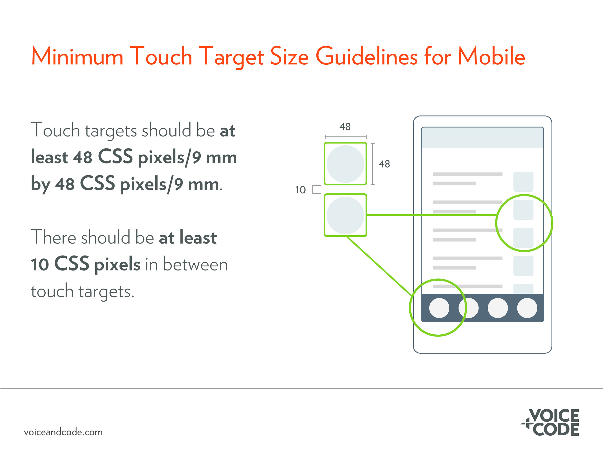
When designing for mobile devices, don’t place tappable elements too close together and ensure the touch target size is large enough is large enough. In general, this means target sizes should be at least 48 CSS pixels/9 mm by 48 CSS pixels/9 mm. A CSS pixel is an attempt to standardize units of measurement across devices that have different resolutions. Because that’s confusing for people who aren’t developers, it’s more important to note the physical size: 9 mm, which accommodates the size of finger. The touch target size refers to the area on the interface that will initiate an action—like navigating to another page—and not necessarily the size of the icon or button itself. That does not, however, mean that icons should be significantly smaller than 9mm by 9mm. In fact, there are circumstances where the target size or icon/text/button size should be much larger. For example, where accuracy is important or when user dexterity or vision could affect how well they can interact with the target.
In addition to the size of the target, tappable elements should be far enough away from one another to prevent the user from tapping on the wrong element accidentally. At a minimum, items should be at least 10 CSS pixels away from one another. As with touch target size, there are many circumstances where there should be more space placed between targets.
Of course, the best way to minimize errors using touch screens is to observe representative users through a usability study. Seeing where users have difficultly accurately navigate your website or app will help you pinpoint places where touch target sizes should be larger or elements should be placed further apart.

