Don’t Waste Money on New Website Features When You Haven’t Gotten the Basics Right
Your organization’s website is designed to drive action. That action could be to buy a product or service, publish user-generated content, make a donation, or promote advocacy. When the website is not meeting the goals of a specific action, organizations too often focus on getting more people to the website. This path ends up being a numbers game the organization is destined to lose for one key reason: the website is not meeting even the most basic of user expectations. I’ve seen this issue over and over again regardless of website size or budget.
What’s worse, organizations throw money at solutions that will not address the core issue. They add features when the website should actually be less complex. Or, while they may see an increase in traffic based on SEO-optimization or paid search, they still aren’t getting the results they want.
What’s the issue? These organizations don’t have a comprehensive understanding of users’ expectations, goals, and behaviors. They don’t understand what’s important to them or how they make decisions. Without this, it’s impossible to create an effective website—one that aligns business goals with user goals.
Common issues in getting the basics right
Common mistakes often fall into the following categories:
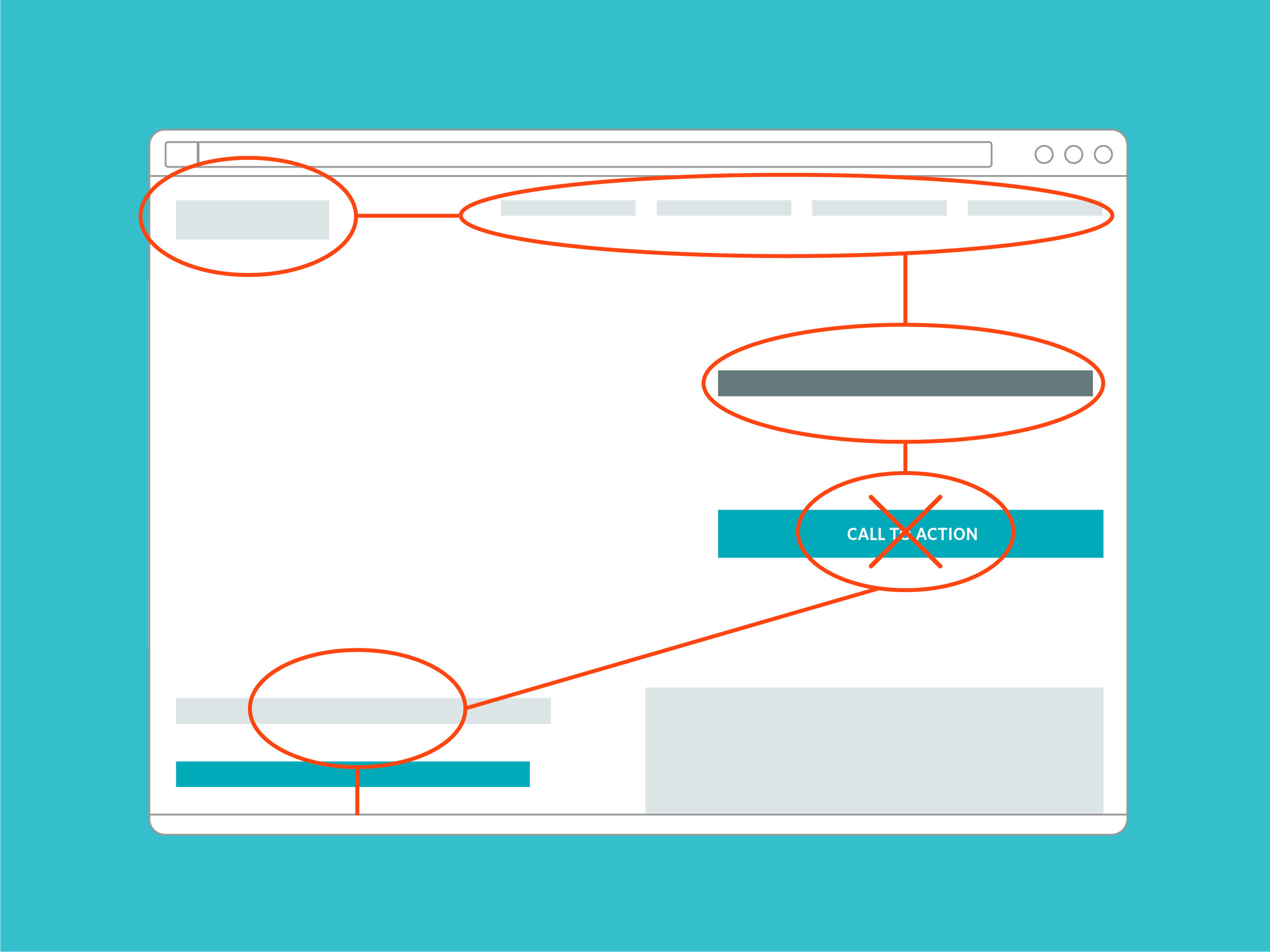
Business goals and user goals are not aligned. In many cases, organizations are not providing the value the user is expecting. This could be in terms of content or product/service offerings. Either way, the user is not likely to stick around. If your team is coming up with rude and obtrusive ways of coerce users to do things they don’t want to do or aren’t ready to do, you’re probably not providing enough value to your users.
Users don’t know what you do or why they should care. Typically, this is a result of poorly written and structured content. This is also the reason why we place so much emphasis on language at Voice+Code—the words you use critical in helping users understand the value you provide. Because users scan instead of reading, often missing chunks of content, it’s also important to ensure the copy is presented in a way that improves comprehension.
The website’s information architecture is confusing. Users rely on the site’s information architecture (how the content of the site or application is structured or labeled) to determine where they are and what they can do on the site. Even on relatively simple sites or applications, users often cannot successfully perform tasks because the navigation is confusing. Not surprisingly, disorienting websites degrade the user’s entire experience and often lead to users abandoning the site.
How do you get the basics right?
The most effective way to ensure you are providing value, communicating effectively, and have an effective information architecture is to observe representative users. By asking potential website users to perform real-world tasks you will uncover where they are confused, annoyed, or underwhelmed. The most effective way to ensure you are providing value, communicating effectively, and guiding users to where they need to go is to observe representative users. By asking potential website users to perform real-world tasks you will uncover where they are confused, annoyed, or underwhelmed. Careful follow-up questions will unveil frustrations, mental models, and unmet expectations.
Don’t waste money developing new features or investing in getting people to your website when your money is better invested in first getting the basics right. By taking the time to understand your users, you can provide them with what the really want: a solution to their problems.
Interested in learning more about how to conduct user research? Our How to Conduct a Usability Study workshop shows your team how to conduct usability studies to help your business measure and achieve its user experience goals.

